
The Anatomy of a Landing Page: The 2026 Guide
How a landing page should be built in 2026 to win enquiries: structure, mobile, responsive design, Core Web Vitals, SEO, AI search and a go-live checklist.
This article is also available in German.Read the German version
A landing page has one job: turn a visitor with a specific need into an enquiry, a call or a purchase. That sounds simple. Yet many pages fail at it because they try to do too much at once, do not work on a smartphone or never show up on Google in the first place.
A lot has changed since we ran our first landing page workshop in 2019. Google now judges websites only by their mobile version, measures speed with new metrics and increasingly answers questions itself with AI. In this guide we sum up what matters today: from structure and copy to the technical build on mobile and desktop.
The key points
- One page, one goal. The page focuses on one topic and one next step.
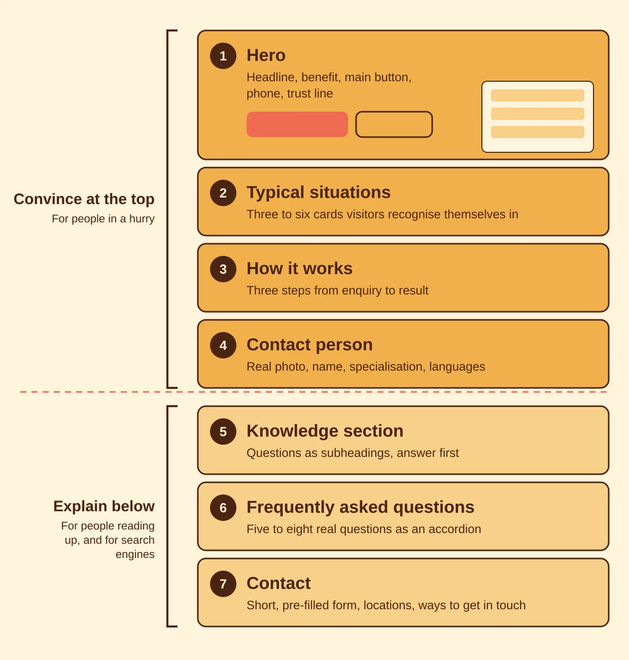
- Convince at the top, explain below. The first screen sells, the lower part delivers the content that Google and AI answers need.
- Mobile first. Since July 2024 Google indexes the mobile version only. You design for the smartphone and derive the desktop from it.
- Fast and stable. The Core Web Vitals (LCP, INP, CLS) help decide rankings and how patient visitors are.
- Measure, don't guess. Every landing page is a hypothesis. Only the data shows whether it holds.
What is a landing page, and why does it work?
A landing page is a page where visitors deliberately "land", usually from an ad, a search or a link in a newsletter. Unlike the home page, which has to serve many audiences and topics, it focuses on one topic, one need and one action.
That focus is exactly what makes it effective. Someone searching for "received notice of dismissal, what now?" does not want an overview of every service a law firm offers. They want to know whether they are in the right place and how to get help quickly.
One page instead of three
People used to separate conversion pages (for advertising) from SEO pages (for organic search). For most businesses that is needlessly complicated. Better: one page per topic that does every job, but with a clear priority:
- Triggering enquiries is the main goal. Everything on the first screen serves it.
- Being found on Google. The page has its own URL, clear headings and enough expert content.
- Building trust and appearing in AI answers. Real people, good answers to real questions, local presence.
The structure from top to bottom
A proven order that suits service providers, law firms, agencies and many B2B offers:
1. Hero: the first screen
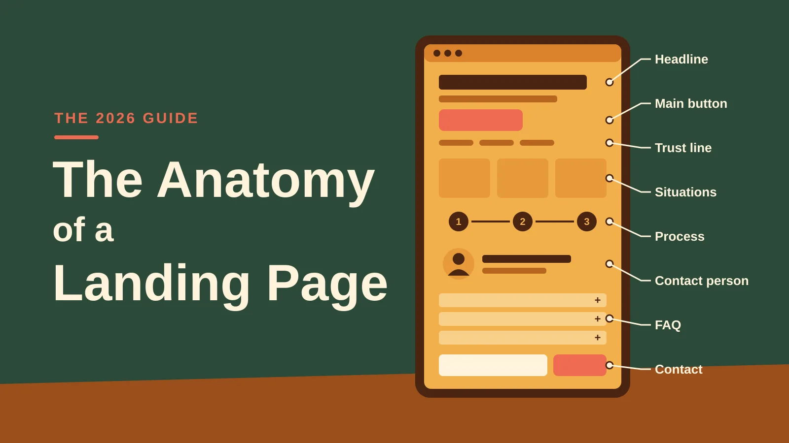
The most important area of the page. Within a few seconds it decides whether someone stays. The hero contains:
- A headline that names the need, not just the topic. "Received notice? We review your situation before deadlines run out." is stronger than "Employment law".
- One sentence with benefit and audience: for whom, where, what.
- One main button with specific copy, for example "Request an initial assessment" instead of "Submit".
- An alternative for people in a hurry: the phone number.
- A trust line: locations, languages, certifications, response time.
- On desktop, optionally the form right next to it.
2. Typical situations
Three to six cards in which visitors recognise themselves. Each card describes a situation in one or two sentences and links to a page that goes deeper. That helps visitors find their way and helps Google understand which topics the page covers.
3. How it works
Three steps from enquiry to result. Uncertainty is one of the biggest reasons people do not get in touch. A clear process, ideally with a statement about costs, removes that hurdle.
4. Contact person
A real photo, a name, the specialisation, languages spoken, perhaps a short quote. People buy from people, especially with services that require trust. Interchangeable stock photos achieve the opposite.
5. Knowledge section
This is where the "lower part" for Google and AI begins. Short sections whose subheadings are phrased as questions, the way customers ask them. The answer comes in the first sentence, the details follow. Add an author with a profile and the date of the last review.
6. Frequently asked questions
Five to eight real questions from practice: costs, duration, documents needed, languages. As an accordion this is easy to use on a smartphone.
7. Contact
The form again at the end of the page, short and pre-filled, plus all locations and ways to get in touch.
Ten rules for more enquiries
- The need, not the topic, in the headline. The headline describes the visitor's situation.
- Short subheadings. Visitors scan first. Every heading says what follows.
- Clean language. Error free, easy to understand, no jargon.
- Trust signals. People, locations, references, memberships, register entries.
- One goal per page. One main button, labelled the same everywhere.
- The button stands out. Its own accent colour, used only for calls to action, and enough white space around it.
- Few distractions. No sliders, no pop-ups, few external links.
- Fitting images. Real people and places instead of stock.
- The first screen counts. Headline, benefit and button are visible without scrolling, on mobile too.
- Always measure. Compare, improve, measure again.
Button copy: specific, not generic
| Instead of | Better |
|---|---|
| Submit | Request an initial assessment |
| Contact | Arrange a call back |
| Learn more | Describe your situation |
| Buy now | Get a quote in 2 minutes |
The form
- Four required fields at most. Name, contact method, topic, short description.
- Topic pre-selected, matching the page.
- Label above the field, not as a placeholder inside it. Placeholders disappear as you type, and then nobody knows what was asked.
- Explain errors right at the field, not only after submitting.
- Confidentiality and response time stated right next to the button.
- After submitting: a confirmation with the next step.
- Test the number of fields instead of cutting blindly. Fewer fields often bring more enquiries, but not always better ones. What counts is what comes of them in the end.
- Data protection: Since 1 September 2023 the revised Swiss Federal Act on Data Protection (revFADP) has been in force. A short, linked notice at the form is part of it.
Mobile first: why the smartphone sets the design
The numbers
In Switzerland around 45% of all page views come from smartphones, tablets not included (StatCounter, June 2026). For local and urgent searches, for a lawyer, tradesperson or doctor for instance, the share is often well above 50%. The only reliable figure, though, is your own: in Google Analytics 4 you can break it down by device category under "Tech".
Even more important than the share of visitors is Google itself. Since July 2024 Google crawls and indexes all websites with the smartphone crawler only (Google Search Central). What is missing from the mobile version does not exist for Google.
What that means for the design
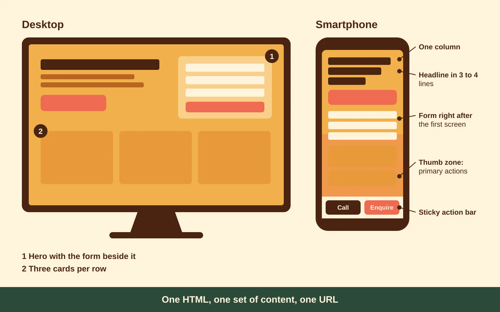
- Design from 360 to 414 px wide. The desktop version is derived from the mobile one, not the other way round. Anyone who "shrinks down" from desktop ends up with squeezed layouts and hidden content.
- One column. Cards and blocks sit one below the other. Every block starts with a clear subheading.
- Headline in three to four lines at most. No large image that pushes the text below the first screen.
- Sticky action bar at the bottom with "Call" and "Enquire". It stays visible while scrolling and sits within thumb reach.
- The form follows right after the first screen, not only at the very bottom.
- Don't collapse core content. Accordions are good for secondary content such as FAQs, but the way into the topic must be visible without tapping.
Using it with a thumb
On a smartphone people tap, they don't click. That has consequences:
- Tap targets: WCAG 2.2 requires at least 24 x 24 CSS pixels (W3C, SC 2.5.8). Apple recommends 44 pt, Google Material Design 48 dp. Our rule of thumb: buttons at least 44 to 48 px high, the main button full width.
- Spacing: links and buttons not packed closely together, especially in lists and in the footer.
- Thumb zone: primary actions belong in the lower half of the screen, where the thumb reaches without shifting grip.
- Everything tappable: phone number as a
tel:link, email asmailto:, address with a link to the map. - Never lock zoom.
maximum-scale=1oruser-scalable=nobreaks accessibility and frustrates older visitors.
Forms on mobile
- Input text at least 16 px. Below that, Safari on the iPhone automatically zooms into the page when a field is tapped.
- The right field types bring up the right keyboard:
type="tel"for phone,type="email"for email. - Autofill with
autocomplete="name","tel","email". The phone then fills in the fields itself. - No visible CAPTCHA. Prefer invisible spam protection (honeypot field, server-side check).
- Call back as an alternative: just name and phone number, for everyone who does not want to type on the go.
<label for="tel">Phone</label>
<input id="tel" name="tel" type="tel" autocomplete="tel" inputmode="tel">

<label for="email">Email</label>
<input id="email" name="email" type="email" autocomplete="email">
What must not happen on a smartphone
Responsive design: one page for mobile and desktop
Responsive design means one HTML, one set of content, one URL, and the layout adapts to the screen size with CSS. Separate mobile sites on m.example.ch or different content per device are outdated and, since the complete switch to mobile-first indexing, tend to cause problems.
The viewport
Without this line in the <head>, the smartphone displays the page like a shrunken desktop:
<meta name="viewport" content="width=device-width, initial-scale=1">Mobile-first CSS
The base styles apply to the smartphone. Larger screens get extensions with min-width. That way the phone only loads what it needs, and the layout is built from simple to complex.
/* Base: smartphone, one column */
.hero { display: grid; gap: 1.5rem; }
.cards { display: grid; gap: 1rem; }

/* From tablet: two columns */
@media (min-width: 700px) {
  .cards { grid-template-columns: repeat(2, 1fr); }
}

/* From desktop: hero with the form beside it, three cards per row */
@media (min-width: 1024px) {
  .hero { grid-template-columns: 1.25fr 1fr; gap: 3.5rem; }
  .cards { grid-template-columns: repeat(3, 1fr); }
}
Breakpoints follow the content, not devices. Drag the browser window wider and set a breakpoint where the layout stops looking good. Device lists go out of date every year.
Fluid type and spacing
Instead of defining font sizes for every breakpoint, clamp() lets the type grow smoothly:
h1   { font-size: clamp(1.9rem, 1.2rem + 3vw, 3.1rem); line-height: 1.12; }
body { font-size: clamp(1rem, 0.95rem + 0.25vw, 1.0625rem); line-height: 1.6; }
For readability: body text at least 16 to 18 px, 60 to 80 characters per line, high contrast.
Components, not pages: container queries
A card can now respond to its own width, not just the screen width. That is handy when the same component sits once in a narrow sidebar and once in the wide main area:
.card-wrap { container-type: inline-size; }

@container (min-width: 420px) {
  .card { display: grid; grid-template-columns: 120px 1fr; }
}
Images: sharp on the phone, light on mobile data
- Modern formats: WebP or AVIF instead of JPEG and PNG.
- The right size per device with
srcsetandsizes, so the phone doesn't load a 2,400 px wide desktop image. - Never lazy load the hero image. It is often the largest element on the first screen and determines the LCP. Use
fetchpriority="high"instead. - All other images with
loading="lazy". - Reserve space with
widthandheightoraspect-ratio, so nothing jumps. - Alt texts for accessibility and image search.
<img
  src="team-800.webp"
  srcset="team-480.webp 480w, team-800.webp 800w, team-1600.webp 1600w"
  sizes="(min-width: 1024px) 50vw, 100vw"
  width="1600" height="1000"
  alt="The team in the meeting room in Zurich"
  fetchpriority="high">
With <picture> you can also show a different crop on mobile, a portrait format instead of a wide panorama for example. The content stays the same, only the crop changes.
The sticky action bar: mobile only
.sticky-cta { display: none; }

@media (max-width: 699px) {
  .sticky-cta {
    display: flex; gap: .6rem;
    position: fixed; inset: auto 0 0 0;
    padding: .6rem .9rem calc(.6rem + env(safe-area-inset-bottom));
    background: #fff; border-top: 1px solid #d9dde0;
  }
  body { padding-bottom: 5rem; } /* so the bar covers nothing */
}
env(safe-area-inset-bottom) makes sure the bar does not disappear under the home indicator on iPhones. It also makes sense to hide the bar as soon as the contact form is in view.
Telling touch from mouse
Not every large screen has a mouse, and not every phone is small. Instead of only asking about width, you can query the type of input:
/* Hover effects only where there really is a mouse pointer */
@media (hover: hover) and (pointer: fine) {
  .card:hover { box-shadow: 0 12px 30px rgba(0,0,0,.08); }
}

/* Larger tap targets on touch */
@media (pointer: coarse) {
  .btn { min-height: 48px; }
}
Important information must never be visible on hover only, because there is no hover on a phone.
Screen height on the phone
100vh is unreliable on mobile because the address bar slides in and out. The newer units svh, lvh and dvh solve this. For a hero that fills exactly the first screen, min-height: 100svh works well.
Respecting settings
@media (prefers-reduced-motion: reduce) {
  * { animation: none !important; transition: none !important; scroll-behavior: auto !important; }
}
Anyone who has reduced motion in their operating system gets no animations.
Test, test, test
- Real devices: at least one current iPhone and one Android device. The browser simulator does not fully replace them, especially for keyboard, zoom and forms.
- Browser developer tools for quick checks at different widths.
- PageSpeed Insights and Search Console for real user data.
- Simulate a slow network to see what happens on the train between two tunnels.
Speed: the Core Web Vitals
Google measures three metrics from real users. A page passes when 75% of visits meet the thresholds (web.dev):
LCP (Largest Contentful Paint)
≤ 2.5 s
When the main content is visible
INP (Interaction to Next Paint)
≤ 200 ms
How quickly the page responds to taps and clicks
CLS (Cumulative Layout Shift)
≤ 0.1
How much the layout jumps while loading
| Metric | Typical measures |
|---|---|
| LCP | Small, prioritised hero image, fast server, little render-blocking CSS and JavaScript |
| INP | Few scripts, no heavy widgets, scrutinise third-party tags |
| CLS | Reserve space for images, banners and fonts |
INP replaced the old FID metric in March 2024. FID only measured the delay of the very first interaction, INP rates every interaction during the visit and is therefore much stricter. On site builders such as Wix, Squarespace or WordPress with lots of plugins, INP is often the metric that tips first.
Getting found: SEO for landing pages
The basics
| Element | Rule | Example |
|---|---|---|
| URL | Short, descriptive, lower case | /advokatur/arbeitsrecht |
| Title | About 50 to 60 characters, search term first | Employment Lawyer Graubünden | Firm name |
| Meta description | About 150 to 160 characters, benefit and call to action | Dismissal, pay, employment contract: advice at 6 locations in 5 languages. |
| Headings | Exactly one H1, logical H2 and H3 below it | H1: Employment lawyer |
| Internal links | Link the main page and subtopics to each other | Situations, team, contact |
| Structured data | Schema.org for organisation, people, breadcrumb | LocalBusiness or LegalService, Person, BreadcrumbList |
| Language versions | One URL per language with hreflang | /it/avvocatura/diritto-del-lavoro |
What has changed
- FAQ snippets are all but gone. Since August 2023 Google only shows FAQ rich results for well-known government and health websites (Google Search Central). FAQ markup does no harm, but for most websites it no longer earns a special display. The FAQ content itself stays valuable: for visitors and for AI answers.
- Length is not an end in itself. There is no ideal word count. The page should be as detailed as the topic requires, and no longer.
- Experience counts. Google talks about E-E-A-T: experience, expertise, authoritativeness and trustworthiness. For topics involving money, health or law this matters especially. Visible authors with qualifications and a review date help.
Visible in AI answers
Since March 2025 Google has shown AI Overviews above the search results in Switzerland too, in German, French, Italian and English. Add ChatGPT, Perplexity and other assistants that link to websites as sources. AI answers appear mainly for questions, which is exactly where the knowledge section of a landing page comes in.
What helps you get cited as a source:
- Answer first. The key statement in the first sentence of the section, the details after it.
- Questions as subheadings, phrased the way customers ask them.
- Clear structure: lists, short tables on deadlines, costs or processes.
- Show experience: author with title and profile, examples from practice.
- Keep it current: date of the last review visible, updated when things change.
- The same details everywhere: company name, addresses and phone numbers identical on the website, the Google profile and directories.
Clicks from AI answers are rarer than from classic search results, but often better qualified. People who find you there arrive with prior knowledge and trust.
Getting found locally
For searches such as "lawyer St. Moritz" or "fiduciary Zurich", Google on a smartphone first shows the map with business profiles. So:
- One Google Business Profile per location, with category, opening hours, photos and a link to the matching page, not just the home page.
- Location pages with real content: local team, directions, languages, focus areas. Copied texts with the place name swapped achieve nothing.
- Consistent contact details everywhere, including a single email domain.
- Reviews help locally. Regulated industries have their own rules for them, which you should clarify beforehand.
Trust in regulated industries
Law firms, doctors, financial service providers and fiduciaries have additional rules. For lawyers in Switzerland, for example, advertising must remain objective and meet the public's need for information (Art. 12 lit. d BGFA, the Swiss Lawyers Act). For landing pages that means:
- no promises of success and no superlatives
- client testimonials only anonymised and with consent
- explain costs and process transparently
- have the specialists themselves review the final copy
That is not a restriction but an advantage: objective, helpful pages convince people in difficult situations far more than loud advertising.
Measure and improve
What to measure
- Form submitted
- Tap on the phone number (especially on mobile)
- Click on the email address
- Rankings, clicks and Core Web Vitals per page
With what
- Google Analytics 4 and Google Tag Manager for conversions
- Google Search Console for queries, rankings and Core Web Vitals
- Google Ads conversion tracking, if you run ads
- Consent Mode, aligned with the cookie banner
Testing
Google Optimize was shut down in September 2023. For A/B tests there are alternatives such as VWO or Optimizely. With little traffic, however, classic A/B tests are hardly meaningful. Then it makes more sense to test big changes one after the other (before and after) rather than many small ones at once. Good candidates:
- Headline and subline
- Copy and colour of the main button
- Length of the form
- Sticky action bar on mobile: yes or no
Checklist before go-live
Content and enquiry
- Headline names the need, not just the topic
- Exactly one main button, labelled the same everywhere
- Form with four required fields at most, tested
- Enquiries reach the right person
- Contact person with a real photo
- FAQs answer costs and process
- Copy reviewed for expertise and legal points
Mobile
- First screen: headline and button visible without scrolling
- Action bar with call works
- Cookie banner covers neither headline nor button
- Tap targets at least 44 px
- Input fields with at least 16 px text and the right field types
- Tested on iPhone and Android
- No horizontal scrolling
Technology and SEO
- Own URL, title and meta description
- One H1, logical H2 and H3
- Author and review date visible
- Internal links to subtopics, team and contact
- Structured data added and tested
- Core Web Vitals in the green on mobile
- Tracking and consent checked
- Page submitted in Search Console
Conclusion
A good landing page is neither a design project nor an SEO project, but both at once, with a clear priority: it should bring in enquiries. At the top it convinces people in a hurry, below it delivers the content that searchers, Google and AI assistants need. It is designed for the smartphone, built as one responsive page for every device, and improved with real data.
Planning new landing pages or want to know where your existing pages are losing enquiries? We are happy to look at them with you: just send us a message through our enquiry form.
Sources
- Google Search Central: Mobile-first indexing has landed (June 2024)
- Google Search Central: Changes to HowTo and FAQ rich results (August 2023)
- web.dev: Defining the Core Web Vitals metrics thresholds
- W3C: WCAG 2.2, Understanding Success Criterion 2.5.8 Target Size (Minimum)
- StatCounter Global Stats: Desktop vs Mobile vs Tablet Market Share Switzerland
- Federal Act on the Free Movement of Lawyers (BGFA), Art. 12